Support | Portal
Discovery Panel Report
View relevant data in insightful ways. Get an introduction to your metabolomics results—see the “story” in the data and find areas of interest.
Visualization Legend

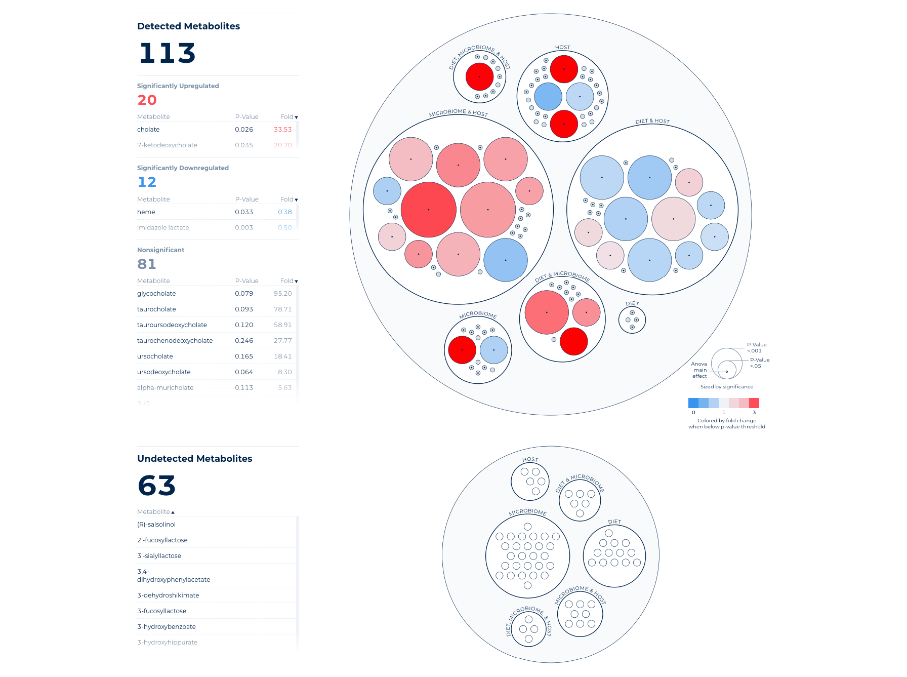
The Discovery Panel Report visualization shows Detected Metabolites. Within the Detected Metabolites, we further classify these results into Significantly More Abundant, Significantly Less Abundant, and (statistically) Nonsignificant Differences.
Each metabolite is represented by a circle, which is sized by p-value (smaller p-value, larger circle) and colored by the direction and intensity of change. A more intense color indicates a larger fold change difference. If ANOVA Main Effects are included in your study design, results will be indicated by a dot in the center of the circle with more information on hover.
Choose Your View
There are a few ways you can adjust the view of your Discovery Panel Report:

Your Discovery Panel report visualizes statistical comparisons (one group compared to another). Select which comparison to view by using the “Select Comparison” drop-down menu. Here you will see the group comparisons defined by your study design.
This slider gives you the ability to adjust the limit of significance (p-value) shown in the visualization and classification tables. Sliding to the right will widen the range of significance, while sliding to left will narrow the range to only the most statistically significant metabolites for the chosen comparison.p-values for each comparison are derived from the Natural Log-Transformed Data using the corresponding statistical analysis (e.g., t-Test, ANOVA, etc.).
Use this drop-down to find or search for a particular metabolite from within the Discovery Panel. Once selected, the metabolite will be highlighted within the visualization.
Learn About Your Study Results
The Discovery Panel Report visualization is designed to give you both an “at-a-glance” view of the areas of significance within your study results and also enable deeper insight.
Interacting with your data by hovering over each metabolite circle will bring up more detailed information about that metabolite within your chosen comparison, such as metabolite name, p-value, fold change, and main effect (if applicable). Hovering over a metabolite name within a table will temporarily highlight the metabolite’s location within the visualization.
Selecting a metabolite circle (or name within a table) will highlight it and allow you to track how it changes across multiple comparisons.
You can view tabular data by ascending or descending values by clicking on the table header by which you wish to sort. Sort order will be reflected on all tables with related values.
Explore Pathways
Start digging into the meaning behind your study results by leveraging our deep annotation.
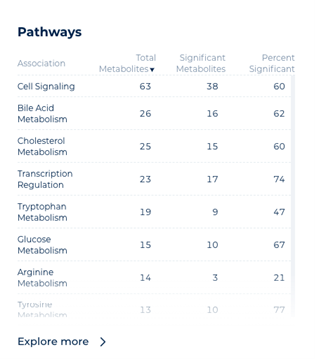
Each table shows the association name, total number of metabolites of association, number of associated metabolites with a significant result inyour study, and the percentage of significant metabolites to the total number associated.

Pathways
View the interconnected power of the metabolome by exploring associated biochemical pathways that reveal biological function.
Portal Navigation
Getting Started
Overview & FAQs
Common How-Tos
Discovery Panel Report
Impact Explorer & Heliogram
Profile Finder
Knowledge Base
Product Glossary
Experimental Procedures
Statistical Methods & Terminology
Data Privacy & Security
Share this page
See how Metabolon can advance your path to preclinical and clinical insights
Contact Us
Talk with an expert
Request a quote for our services, get more information on sample types and handling procedures, request a letter of support, or submit a question about how metabolomics can advance your research.
Corporate Headquarters
617 Davis Drive, Suite 100
Morrisville, NC 27560
Mailing Address:
P.O. Box 110407
Research Triangle Park, NC 27709

